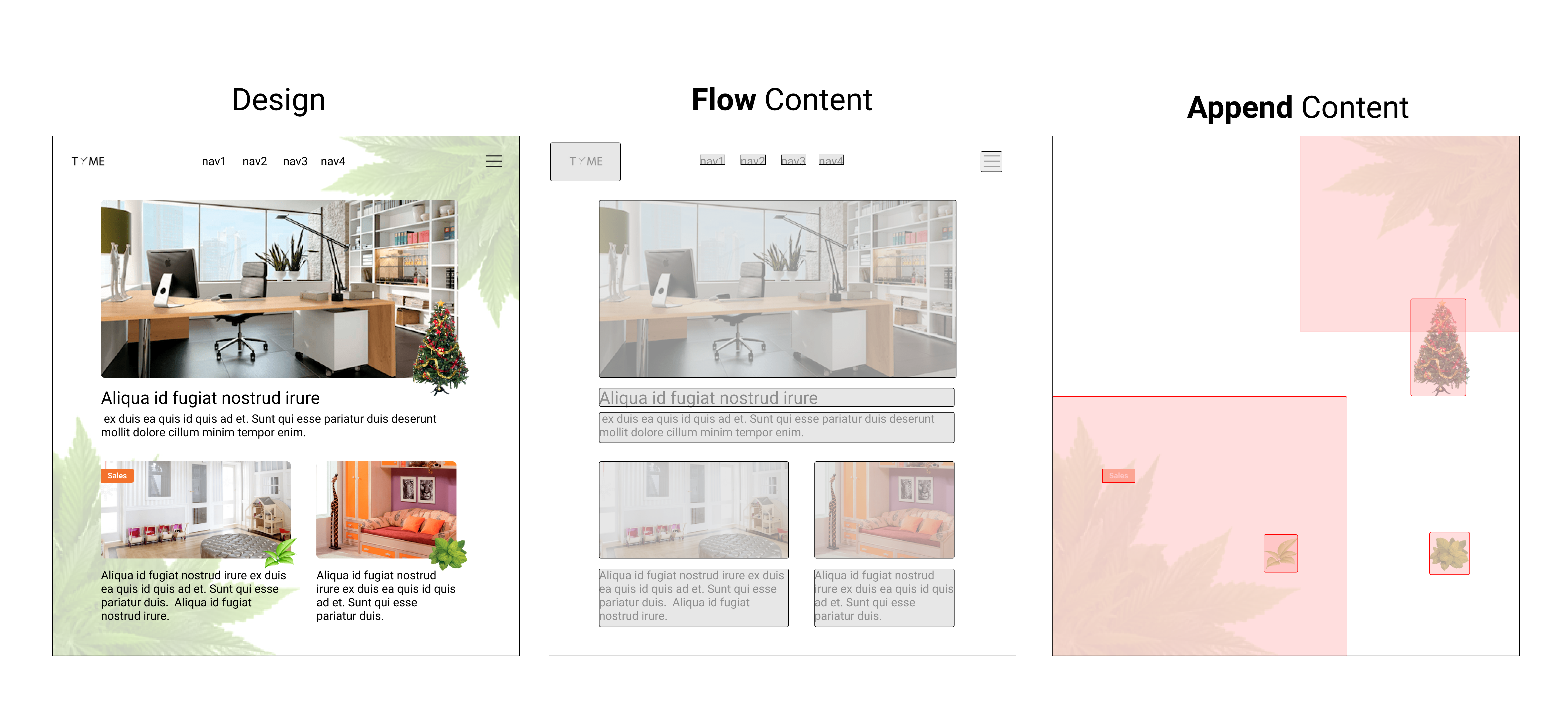
Structure
In HTML, the Flow Content is the combination of row and column content.
Beside, the other one that are attached to Flow Content is Append Content, or Out of Flow Content.
To summarize,
| Flow Content | Append Content |
|---|---|
| Combination of by row and column content | Attach to specified Flow Content |
| Take up space | Spaceless |
| won't overlap with other Flow Content | might overlap with other Content |
Structure represents converting design content into "Flow Content" and "Append Content"
tip
Structure = Flow Content + Append Content
How to structure the content?
Here are the simple few steps:
- First, think of the structure with proper responsive behaviors!
- Move out Append Content
- Layout the Flow Content by ow and column, one by one in top-bottom way
- Move back each Append Content and Attach to proper Flow Content
You can go through the steps with the slides below.
Let's do structure editing in pxCode
You can also try to import the sample via our Github to practice
Add responsive behaviors to structure
After all "Buggy Groups" are solved, it means that the structure is ready, we can then start adding responsive behaviors.
By adding responsive behaviors, it helps the content to flow across different resolutions.
As we can see, while we set a margin in smaller resolution, the content's direction will be change from row to column, while the font becomes smaller, items are hidden in smaller resolution as well.
To conclude the responsive behaviors,
tip
The responsiveness is override different property values to response to different resolutions
Nex, let's get into the details of responsiveness.