Flex
Flex is the most important layout because it applies to all the flow content for layout in row and column direction.
Flex also helps distribute the space while changing width resolution.
In pxCode, we use classic Flex for original resolution and use Fusion Flex for 8 resolution ranges.
Original - Classic Flex
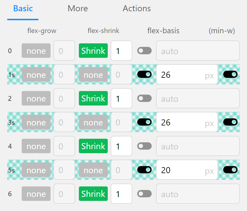
Classic Flex is the default CSS flex way by using Grow, Shrink, and Basis to distribute the Flex's parent space.
The Flex cell set Grow means it would gain space while the parent Flex grows. Similarly, the Flex cell set Shrink means it would shrink and give away space while the parent flex shrinks.
You can easily use grow and shrink for each cell to acheive different behaviors.
MediaQuery for 8 Ranges - Fusion Flex
Bootstrap is the most popular frameworks for Responsive Web because it's flexibility and easy to use.
Besides, Bootstrap has a serious drawback that the design should follow, otherwise the result would not be same as the original. It is because the predefined rules in Bootstrap, such as the 12 grid system and fixed Gutter Size.
Therefore, pxCode invented Fusion Flex - combining Bootstrap's flexibility while keeping the original design in Pixel-Precision.
You can refers to the slides or video above to get more details.