Responsiveness
tip
The responsiveness is override different property values to response to different resolutions
Let's get into more details
Different Resolutions
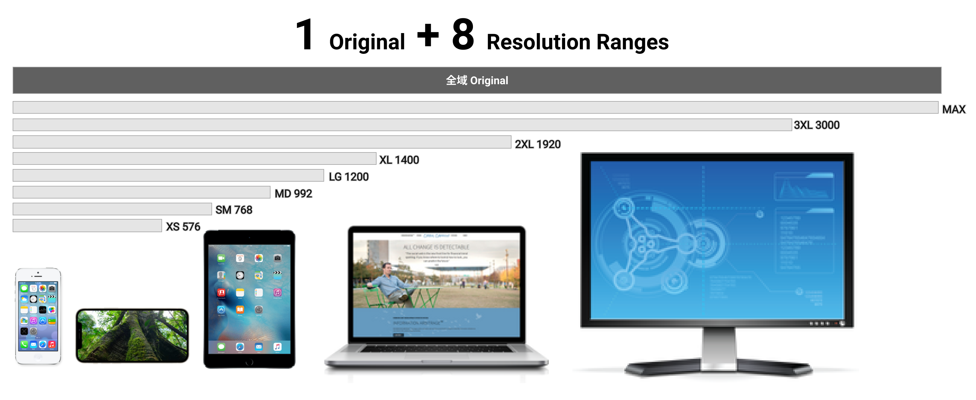
1 Original in Default
For every resolutions, all the layout and styles have an original settings. It might be decided by the design itself, but we can change the values directly on Inspector panel.
8 Resolution Ranges
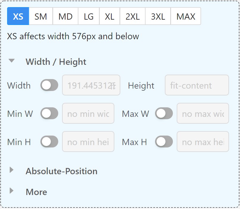
We can also find editing sections within "Resolution Panel", which represent the overrided values for target resolution range.
Resolution Panel in pxCode
pxCode leverage Bootstrap categories with 7 breakpoints, and come out with 8 resolution ranges.
1 + 8 Resolution Ranges
In conclusion, there are 1 default resolution + 8 resolution ranges.
| XS | SM | MD | LG | XL | 2XL | 3XL | MAX | Original |
|---|---|---|---|---|---|---|---|---|
| < 576 | 576 - 768 | 768 - 992 | 992 - 1200 | 1200 - 1400 | 1400 - 1920 | 1920 - 3000 | 3000 - ∞ | ALL |
- 1 default resolution
- 8 resolution ranges for overrided values
You can go through the slides below to understand how it works.
Different values for properties
There are 3 types of properties for responsive values
- Posize
- position
- margin - left, right, top, and bottom
- size
- width x height
- position
- Flex
- direction
- column or row
- space distribution rules for children
- direction
- Styles
- common styles
- font size
- alignment
- display or hidden
- common styles
You can check out more details via links below